
The Safari development team at Apple has made a dedicated effort to
implement Web standards. This means that the easiest way to ensure optimal
rendering of your pages in Safari is by following the standards. Doing so
will also guarantee optimal rendering in Mozilla, Opera and Internet
Explorer for Macintosh. Of course, each of these browsers has its own
minor quirks or legitimate differences of interpretation, so testing your
site in all of them is still mandatory.
By comparison, Internet Explorer for Windowsthe most popular browser
for the Windows OSoften requires web developers to use a number of
non-standard tricks or to accept layout differences. This situation is
unlikely to change anytime soon, so for now, web developers have to work
around these problems.
This article gives some practical hints on how to create
standards-conforming websites, and to work around some of issues that will
arise for Explorer for Windows.
Before you start coding yourwebsite you must make a few decisionswhich
DOCTYPE do you use? Do you use pure CSS, or CSS with Minimal
Tables? We'll discuss these topics, and then go into some design
guidelines and issues to consider with XHTML and CSS.
Doctypes
By using a certain DOCTYPE (strict or transitional) you
claim to have correctly implemented a certain (X)HTML flavor: <!DOCTYPE html PUBLIC "-//W3C//DTD XHTML 1.0 Transitional//EN"
"http://www.w3.org/TR/xhtml1/DTD/xhtml1-transitional.dtd">
When you declare a DOCTYPE, validators take you at your
word. When you validate your pages, they check your code against the
syntax that you claim to follow. If the markup fails to meet the standard,
it gives you error messages.
In addition,most browsers have implemented doctype switching. They use
the DOCTYPE you declare to decide whether the browser should
use Strict or Quirks mode when rendering the page. In Strict mode browsers
strictly follow the CSS specification, while Quirks mode retains a few
browser quirks that were common in the bad old days (before adherence to
standards).
In general, you should opt for Strict Mode. A useful table from
the Helsinki University of Technology tells you how the modern browsers
interpret doctypes and allows you to select a cross-browser one. See also
the A List Apart article Fixing your site with
the right doctype
To fully understand the differences between Strict and Quirks Mode,
study the documentation pages:
There is no official list for Explorer 5 on Mac, but CSS guru Eric
Meyer has summarized
the differences. Safari follows Mozilla.
Despite doctype switching, selecting an (X)HTML flavor remains the most
important function of a DOCTYPE. Which flavor do you feel
comfortable with? Old-fashioned HTML or the newer XHTML? Strict or
Transitional? If you want the very strictest implementation, opt for a
Strict flavor. If you want to give yourself some more leeway, choose
Transitional. If you use frames, you must use the Frameset variant. For
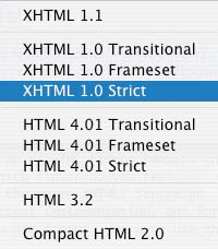
example, in BBEdit, you can use this menu to choose the (X)HTML flavor you
want:
The W3Schools XHTML
Reference and the zvon.org comparison
page give an overview of the tags you may or may not use in Strict and
Transitional. blackwidow.org.uk gives an overview
of permitted attributes and a list of common
validation errors.
Use XHTML 1.0 Transitional if you have no experience with doctypes. It
requires you to use XHTML instead of HTML, and thus forces you to take a
step towards standards-compliant markup. On the other hand it allows for
more tags and attributes than its Strict brother, so it's easier to
implement.
The correct code for using the Transitional DOCTYPE is
shown in the declaration above.
Below you'll find more instructions for writing correct, valid
XHTML.
Page Layout
Most web site templates perform page layout by using a few blocks of
content, for instance a header, a left column with the navigation, a right
column with the main content, and a footer, as shown below:
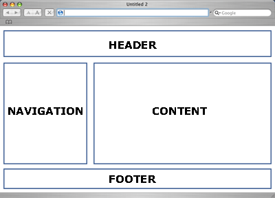
Any attempt to code this page must start by roughly positioning these
four blocks of content. Style details can wait; first you should make sure
that the content blocks are aligned correctly in all browsers on all
resolutions. There are two ways to do this: pure CSS and minimal tables.
Although pure CSS is the best choice overall, it has its problems.
Pure CSS
Generally speaking it's difficult to obtain proper horizontal
alignment in CSS. Horizontal alignment wholly depends on the
float declaration, which, though supported by all modern
browsers, is supported according to two different
models, with minor variations even between browsers that support the
same model.
These problems aren't unsolvable; coding a simple four-block layout
with the float declaration is quite possible. Nonetheless the
danger of insolvable browser incompatibilities increases exponentially
with every floating block you add.
Another common problem with CSS is ensuring a proper page footer. On
long pages that use more space than the window height, the footer should
appear directly below the navigation and content blocks. That's very easy
to code. On short pages, thoughthose that span only part of the window
heightthe footer should nonetheless appear at the bottom of the viewport,
and that's a far trickier code challenge:
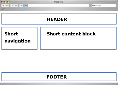
Ensuring that the footer works properly on both long and short pages is
a common cause of CSS headache.
Tables
Tables neatly solve these two problems. Correct horizontal alignment
has been the most important advantage of tables ever since Mosaic. Giving
the table a height: 100% and the cell containing the footer a
vertical-align: bottom makes the footer reliable in all
circumstances.
If the visual design of your web site requires complex horizontal
alignment or a reliable page footer, minimal tables could help you evade
complex browser incompatibilities.
Don't start using those tables right away, though. First try to create
a cross-browser pure CSS page, and don't be shy to ask for help from css-discuss.org. Even if your CSS
experiment turns out not to work, you will have acquired valuable
experience.
Using pure CSS in all circumstances will have to wait until all
browsers support CSS fully. If you've honestly tried to use CSS but
encountered serious browser incompatibilities in the rough positioning of
the content blocks, you should switch to minimal tables.
CSS with Minimal Tables
In the bad old days web developers placed all page elements in tables,
and if the page didn't look as expected it needed yet more tables inside
the already existing tables. This process was repeated until the page
worked. The underlying theory seemed to be If we squeeze enough HTML into
the page it'll work eventually. It made for eternal download times and
nonsensical markup that was impossible to update.
Fortunately this coding style is on the way out. Nonetheless, as we've
seen, tables still offer a few advantages over pure CSS. Minimal tables
are the perfect compromise. They allow you to use the advantages of both
without bloating your code (much).
Minimal table use means: use as little tables as possible. To obtain
our simple four-block layout, the following code is all you need: <table>
<tr>
<td colspan="2">
<div class="header">
Header
</div>
</td>
</tr>
<tr>
<td>
<div class="navigation">
Navigation
</div>
</td>
<td>
<div class="content">
Content
</div>
</td>
</tr>
<tr>
<td colspan="2" style="vertical-align: bottom">
<div class="footer">
Footer
</div>
</td>
</tr>
</table>
This minimal table does a fine job of roughly positioning the four
content blocks. You have created a framework that solves some tricky
problems for you and gives you free rein to fill in all the other details
of your design by CSS.
The table needs many more refinements (a width for the
navigation, a vertical-align for the footer) but that's the
job of the CSS, not the XHTML. You don't need any more tables than this
one.
In general you should style the DIVs inside the TDs instead of the TDs
themselves. For instance, browsers see a width declaration on
a TD as a sort of advice, and they don't hesitate to overrule it when they
think it's necessary. They will always obey width
declarations on DIVs, though.
The only exception is the vertical-align, which
must be declared on a TD.
XHTML
The best way to start coding a new website is to make a rough sketch on
paper. Draw the content blocks, make short notes on the XHTML and CSS
you'll need and try to anticipate the problems you'll encounter. It's
highly unlikely that you'll solve all, or even most, problems by this
rough sketch, but creating it forces you to think logically and to define
the rough outlines of your code. You'll also find that sketching helps you
to remember your fundamental decisions and the reasons behind them better
than just starting to write code.
Then create the XHTML file. If you've never used XHTML before, your
first step should be to ditch some ancient HTML preconceptions.
Fortunately migrating from HTML to XHTML is extremely simple:
- Make all your tags lower case (
<p> instead of
<P>);
- Close all your tags, even empty ones (
<br /> and
<hr /> instead of<BR> and
<HR>);
- Make all attribute names lower case and quote all attribute values;
for example,
<td colspan="2"> instead of <TD
COLSPAN=2>, and onmouseover instead of
onMouseOver;
- Give empty attributes a valuesuch as
<input
        type="checkbox" checked="checked" />
instead of
<INPUT TYPE=checkbox CHECKED>;
- Nest all your tags correctly.
Now your HTML has become XHTML. This is not enough, though. By choosing
a DOCTYPE you have committed yourself to the Strict,
Transitional or Frameset flavor, and you should make sure that you only
use the tags and attributes that your chosen flavor allows.
When you think you're ready, validate your pages. The official W3C Validation Service is the most
logical place to start. Nonetheless its error messages can be quite
verbose and confusing to the uninitiated. W3C is experimenting with a new
validator that gives more understandable error messages.
If you don't quite understand the error messages, ask groups.yahoo.com/group/XHTML-L
for help. You're not the first one to run into a particular problem.
Even when your XHTML is perfectly valid it can contain bad coding. You
have to avoid a few practices that, though not expressly forbidden, are
strongly discouraged.
Tables Revisited
As we saw above, using one minimal table to roughly lay out your page
is quite acceptable. Nonetheless, it is important to stress that this
minimal table should be the only one. Do not insert more tables
into your code. They're not necessary; CSS can do the job for you.
There's one single exception to this rule: you may use tables to
display tabular data, for instance stock quotes or long lists of employees
with their room numbers and phone numbers. For these bits of data (and
only for these bits of data) you can add an extra table to your
code.
If you're not sure if a certain data set requires a table, ask yourself
how you'd display it in print. If you'd use a table even in print, the
data is tabular.
Tagitis
Tagitis is the adding of many useless XHTML tags. This header, for
instance, suffers from tagitis: <h3><em>Header</em></h3>
You don't need the extra <em> tag. One line of CSS
would give the same effect: h3 {
font-style: italic;
}
Classitis and Divitis
A common error of beginning CSS coders is to use far too many
<div> tags and class attributes, like: <div class="header">
<div class="headerText">
<p class="headerP">This site uses CSS!</p>
</div>
</div>
Ninety-nine out of a hundred times these complicated structures are
unnecessary. When you start writing CSS you should avoid them, instead of
thinking you found the one in hundred exception to the rule. Start with
simple XHTML: <div class="header">
<p>This site uses CSS!</p>
</div>
Use these two CSS selectors: div.header {
/* styles */
}
div.header p {
/* styles */
}
You'll find that you can style the entire header by styling these two
selectors.
Black List
Some ancient HTML tags have been deprecated. You should not use them
any more because there are excellent CSS equivalents.
font
You don't need <FONT>. Instead, use: body {
font: 0.8em verdana,sans-serif;
}
There are some issues with font sizes in table cells, though, so to be
completely on the safe side you could extend this declaration to all
common text containers. body,td,li,p {
font: 0.8em verdana,sans-serif;
}
Spacer GIFs
We can say goodbye to the ugliest HTML construct ever conceived spacer
GIFs are no longer necessary. Their purpose was to stretch up table cells
to a certain minimum width, and they were inextricably intertwined with
the hideous table constructs we used in the bad old days. Besides, when
you use one spacer GIF you're seduced into using three dozen more and
spawn bloat code like; <tr><td rowspan=7 width=10><img src="pix/spacer.gif" height=150 width=1>
</td><td width=150><font face=obscurica size=7>Welcome to my beautiful site
<td colspan=4 height=17><img src="pix/spacer.gif height=1 width=23></td></tr>
Nowadays CSS offers far superior ways to set the widths of all
elements. If you think a spacer GIF is the only solution for a certain
problem, it's time to upgrade your CSS knowledge a bit. Again, you should
ask from help, from http://www.css-discuss.org/ if you
can't do it on your own. You're not the first one traveling along this
path.
center
The ancient <CENTER> tag can safely retire, too. CSS
is quite capable of centering text and blocks of content, though there's
one catch.
To center the text in div.text you do: div.text {
text-align: center;
}
Centering entire blocks is somewhat trickier. If you want to center the
entire div.text, the official CSS way is: div.text {
margin-left: auto;
margin-right: auto;
}
auto means: as much as you need. The
<div> takes as much margin as it needs and equally
divides it between left and right. As a result it is centered.
Unfortunately the auto value does not work in Explorer for
Windows. Instead, you must use text-align on a block
containing div.text: div.container {
text-align: center;
}
div.text {
margin-left: auto;
margin-right: auto;
text-align: left; /* overrule inheritance */
}
<div class="container">
<div class="text">
This entire block is centered
</div>
</div>
This use of text-align is not quite standards-compatible,
but it's the only way to make Explorer for Windows behave. And yes, it's
one of the very few cases where divitis and classitis are good for your
page.
Accessibility
When you've created and validated the entire XHTML file you should
perform an accessibility check. Remove all style sheets and JavaScript
from the XHTML and carefully look at this unstyled page. Is the content
ordered logically? Is the navigation clear and usable?
If content and navigation are usable, you've passed the first test. You
should perform many more checks to ensure perfect accessibility, but this
rough test helps you catch the most important and serious issues.
Although Bobby offers
an accessibility validation service, its results are unclear and sometimes
confusing and accessibility specialist Joe Clark has criticized its
methodology. Besides, many accessibility features, like using the
simplest possible language, cannot be validated by a computer; they need
human eyes.
To dive deeper into accessibility issues, read the official W3C Web Content Accessibility
Guidelines. If you want some practical examples and tips, the
excellent accessify.com website is
your best bet.
CSS
You'll probably encounter issues when you apply your CSS, especially in
Explorer for Windows.
Before delving into cross-browser CSS compatibility issues, validate your style sheet.
If it passes this test you are sure that the problems aren't caused by
incorrect code but by incorrect browser implementations.
Validation doesn't remove the problems, though. If you encounter weird
behavior, don't assume you found a bug. Ask for help at the wonderful css-discuss mailing list, where
plenty of experts are ready to lend a helping hand.
If you still think you've discovered a bug, follow the instructions on
the MysteryBug page
to isolate and define the bug. Usually you'll find that you've
misunderstood an obscure detail in the specs.
Nonetheless there are some serious issues related to Explorer for
Windows in particular (you shouldn't find these with other browsers):
- Box model. Explorer 5 for Windows does not support the W3C
box model. Explorer 6 does, but only in Strict mode. The W3C box model
defines the
width of a box as the width the
content of this box takes. The traditional box model applies
width to the borders, padding and content of a box.
- Advanced selectors. Explorer for Windows does not support the
child selector (
>), the adjacent sibling selector
(+) and the attribute selector (p[class]).
- Advanced pseudo-classes. Explorer for Windows does not
support the
:focus and :first-child
pseudo-classes.
- Fixed position. Explorer for Windows does not support
position: fixed.
- Background attachment. Explorer for Windows does not support
the W3C definition of
background-attachment: fixed on
elements other than the <body>.
- Min and max. Explorer for Windows does not support
min-width, max-width, min-height
or max-height, with the very minor exception of a
min-height declaration on <td>'s in
tables with table-layout: fixed (which, in turn, is not
supported by any other browser).
The best way to deal with these incompatibilities is to make sure that
the correct layout of your page doesn't depend on them. If you use these
problematical selectors and declarations not for fundamental CSS
declarations but only for nice extras, you can ignore Explorer for
Windows' incompatibilities.
For instance, the :focus pseudo-class allows you to define
a style for a focused form field. Although this extra style is nice to
have, your page can do without it. Therefore you can safely use
:focus and ignore Explorer Windows' lack of support.
A text that spans a full 1200 pixels of screen width is usually
unreadable. You can solve this problem by applying
max-width: body {
max-width: 600px;
}
Now you've given the body a maximum width, so that your text remains
readable even on large screen resolutions. Although Explorer for Windows
does not support max-width, its users can always resize the
window if they think the text is too wide. Therefore this declaration is
safe, too.
The lack of support for advanced selectors can be a nuisance.
Nonetheless you can evade incompatibilities by only using these selectors
for extra styles, not for basic ones. Thus Explorer for Windows will show
the basic page, even though it doesn't show some advanced styles.
Explorer 5's box model is a more fundamental flaw. You could use the
famous Box
Model Hack, or you could decide the minor differences aren't worth the
trouble. Fluid
thinking can solve many problems, not by hacking your way through
browser incompatibilities, but by embracing a different, more web-like way
of thinking.
The most serious problem by far is position: fixed. Eric
Bednarz has found a pure CSS solution to this problem, but
technically it can be tricky. For instance, when you use his fix you
cannot use position: absolute normally. Read his page well if
you want to implement his solution.
JavaScript
JavaScript suffers from less incompatibility issues than CSS. All
modern browsers, including Explorer for Windows, support the ancient Level
0 DOM and the modern W3C DOM reliably. You should not use the two
proprietary DOMs, Netscape's document.layers or Microsoft's
document.all, any more, though. Safari doesn't support these
DOMs, and neither does Mozilla. Use the
Document.getElementById DOM instead.
Of course there are minor issues in all browsers. See the W3C DOM Compatibility Tables for
an overview.
Conclusions
Although the standards are not yet fully supported by all browsers in
all circumstances, creating standards-compatible pages is the best way to
ensure good rendering. As always, learning to use new technologies will
take some time and will give you some incompatibility headaches.
Nonetheless the results will be well worth the investment.
Links
W3C specifications:
Doctypes:
Validation:
Compatibility tables:
Mailing lists:
- From evolt.org, thelist, for
general web development questions.
- XHTML-L, for
XHTML questions.
- css-discuss, for CSS
questions.
- WDF DOM, for
JavaScript W3C DOM questions.
Accessibility:
Useful:
- A useful list of Tools
for web developers, from the University of Minnesota at Duluth.
| 