Designing for the History Web
General Principles of Design
 e do not have to start such a discussion from scratch. Surely all historians, even those with no experience with the web, have encountered good design in other media, and without getting into any technical issues we can discuss what makes historical materials and the interpretations of them more accessible and thought provoking. Historians who are novices in web design would do well to look at other instances of design than just the web. The bookshelf, home to so much historical endeavor through the ages, is as good a place as any to start.
As Michael O’Malley reminds us, we take the book for granted, but it embodies literally centuries of thought about design and use.9 Indeed, the book’s familiarity masks many of the elements that make it such a rich and easy-to-use medium for ideas. Modern books have limited parameters, certain structures and conventions that have arisen through an evolutionary process akin to natural selection guided by the predilections of book buyers, readers, and publishers. You do not find many outrageously large books or many tiny ones. Indeed, aside from some large format coffee table and special purpose books, most come in an easily handled size between 6 and 12 inches high and 4 and 10 inches wide. The text within a book rarely goes to the edge of the page, instead nestling itself within roughly half-inch to inch-wide margins. Almost without exception there are numbers on the pages to tell you where you are. A title page, table of contents, and index are found far more often than not. In most history books footnotes or endnotes help to clarify the main text and refer to other books and documents. Chapters bring together more focused themes. Certain fonts are more prevalent than others. All of these elements are design choices, though by now so codified and commonplace as to seemingly disappear. Good design, in this case, does not necessarily mean obvious design, or design that attracts attention to itself rather than the content of a book.
Of course, books can also be beautiful. In an age when machine production triumphed over handcrafted goods, some Victorians actually became more interested in high quality design that augmented the beauty of books. Along with his work in the decorative arts and furniture, William Morris designed intricate cover illustrations, page borders, and bindings that lent Kelmscott Press books a rich look and feel. More recent designers of history books have used a mixture of graphics, maps, and text to create elegant works that also help readers come to a robust appreciation of the past. The study of the Peloponnesian War and ancient Greece is surely enhanced by the dynamic and beautiful design of Robert Strassler’s Landmark Thucydides. Few historians would argue that this edition is inferior, say, to the flat, uninterrupted text of a cheap paperback edition. Diagrams explaining complex battlefield movements or photographs of archaeological finds from the era, such as coins and vases, are aptly placed adjacent to the relevant passages by Thucydides. One feels the reality of the war and the way of life in the fifth century b.c.e. far more than if the text (rich as it is with Thucydides’ lucid depictions) was on an otherwise barren page.10
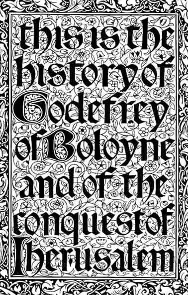
Figure 22: When information sources proliferate, design helps to distinguish them. The mass production of books in the Victorian age led some aesthetes, such as William Morris, to expend a greater effort on design, shown here in an elaborate title page to Kelmscott Press’s The History of Godefrey of Boloyne and of the Conquest of Jherusalem.
Graphical elements in books such as the Landmark Thucydides, including charts, small photographs, and other images, have achieved a certain formal design status in the same way the text of books has, though perhaps with less consistent success. As information designer Edward Tufte has shown with great skill in his books on information visualization, the presentation of graphics in print is often lacking compared to the presentation of text. Like text, visual information should be an effective means of communicating ideas from historians to their audiences, as well as allowing those audiences to draw their own conclusions, just as they do reading interpretive prose. But sometimes graphics that break up the text of history books and essays, such as bar graphs and pie charts, create unnecessary distractions rather than provide substantive information. Instead of helpful graphical additions, publishers and authors often treat readers to what Tufte derisively labels “chartjunk.”11
To combat this tendency, Tufte provides some basic design rules that are as useful online as they are in print. He highlights the essential tension between getting lots of information across to a reader or viewer in a small amount of space and crowding the page with “ink.” For Tufte, the elegance and impact of design comes in the resolution of this tension. How do you get your points across without presenting a dizzying array of text and graphics? How can you maximize expression without cluttering a page? How can you juxtapose elements in a way that allows readers to draw their own conclusions rather than bludgeoning them with the obvious?
One of Tufte’s most celebrated examples of great design in historical texts is Charles Joseph Minard’s map showing the disastrous expedition by Napoleon’s army into Russia in 1812. As Tufte shows, the map (which he believes “may well be the best statistical graphic ever drawn”) accomplishes all that a well-designed historical work should. First and foremost, it depicts a tremendous amount of historical knowledge in a way that illuminates an important conclusion about the Napoleonic Wars and the consequences of Napoleon’s enormous hubris. On the two-dimensional space of the printed page (and similarly on a computer screen) there are actually six variables compared, the most telling of which are the rapidly shrinking size of the French army throughout the ill-fated campaign and the commensurate frigid temperatures of the Russian winter. Of the 422,000 men who leave Poland to conquer Moscow (the beige swath running from left to right), a mere 10,000 return (the black line just below the beige, running from right to left). The tragedy of this pivotal historical event comes through in the thin (and constantly thinning) graphical depiction of the retreating forces. An unconventional yet unmistakable beauty arises from an elegant font, careful proportions, and judicious use of white space and contrast. Minard’s carte figurative is an ideal that one suspects can be emulated, although perhaps not matched, on the web.12
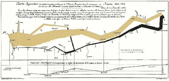
Figure 23: Charles Joseph Minard’s illustration of the fate of napoleon’s army during a cold Russian winter conveys a tremendous amount of historical information in an economical, elegant, and persuasive way. (For a larger, color version, see link 4.12.)
Larry Gales of the University of Washington Computing and Communications Department has done a good job translating Tufte’s ideas to the web. Some of the key points Gales makes are worth adding here, especially for historians who work with statistics, graphics, and images. The breadth and fine-grained quality of a printed page (or poster or work of art) can display a bird’s eye view of a subject more easily than a computer screen, Gales notes. Thus the web implicitly encourages sequential “pages” of information rather than one giant creation in the style of Minard. In turn, this sequentiality and the ease with which you can jump around and between these pages (rather than move in a linear fashion through a book) means that good navigation is essential on the web to allow an audience to figure out where they are and where they might like to go next. At the same time, and in tension with this point, the more space on a web page taken up by navigation, controls, menus, and links, the less left for the content the audience wants. Finally, in the balance between text and graphics, the web (and the Internet in general) still favors text as the best method to disseminate complex information quickly.13
Underlying many of Tufte’s and Gales’s tenets is the technology of the web itself. Part of the problem with translating many of the best design elements of print to the web is that the web is in many respects a greatly inferior medium. Fully unfold a section of the New York Times and hold it up next to an average 15-inch computer screen. Not only is the total page size more than four times as large as the screen, but the much finer printing mechanism of a modern newspaper press (1,200 dots per inch for the Times) compared to a common screen (between 72 and 96 pixels per inch) means that in the former medium text and graphics can be scaled fairly small while still remaining legible. The stock tables and charts in the Wall Street Journal versus the same information on Yahoo Finance makes this abundantly clear—in a two-page spread the Journal can cover most listings on the New York Stock Exchange, whereas on a single screen Yahoo can barely show the chart for the Dow Jones Industrial index and the ten most active stocks for the day. This giant gap in resolution between the old medium and the new makes designers like Tufte despair about the prospects for displaying information elegantly and efficiently on the web.
Worse—and often not appreciated by those new to web design—is that we can’t fully control the medium, even when we can dictate our site’s underlying code. A publisher totally commands the production and display of a book, and once a book is printed it is fixed in its format and doesn’t change (other than to acquire coffee spills, dog-ears, and other hazards of use). By contrast, the web producer may roughly control the design of a site through HTML, but the client computer has a large say in how this HTML renders on a user’s screen. Each browser interprets HTML in its own fashion, which can cause headaches for those who want to be sure that every visitor sees exactly the same thing. Indeed, this consistency is essentially impossible on the web, unlike in print where each copy of a book is identical. Although Microsoft’s virtual monopoly on computer operating systems and web browsers means that close to 85 percent of audiences for historical websites are using a Windows PC with Internet Explorer, there are many versions of both Windows and Internet Explorer, and some combinations render the same web pages slightly differently. In addition, the small minority of Macintosh users (though larger than 5 percent in academic institutions), and a smaller but growing minority of Linux users, will see minor differences in sites compared to the Windows masses. Moreover, screen sizes vary from 640 x 480 pixels on a small screen to over 2,000 x 1,500 pixels on the largest screens. And color can vary somewhat from screen to screen and platform to platform, so that a bright yellow on one computer may look slightly brownish on another.
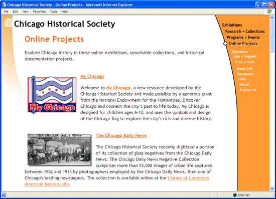
Figure 24a: A Windows PC with Internet Explorer.

Figure 24b: A Macintosh with Safari.

Figure 24c: A Linux computer with Konqueror.
Comparing the Chicago Historical Society’s online projects on an average PC using the Internet Explorer web browsers (Figure 24a), a Macintosh with a larger screen using the Safari web browser (Figure 24b), and a Linus computer using the Konqueror web browser (Figure 24c) shows how a site can appear slightly differently in different situations. With its bigger window, the Mac version stretches the paragraphs horizontally, while its browser mysteriously discontinues the vertical swath of color that runs down the right side of the page. The Linux version breaks apart the Society’s name, and since it does not have the Trebuchet font specified in the HTML for this page (as the Mac and PC do), it defaults to a plainer font that also renders in different sizes in each paragraph. Using web standards such as Cascading Style Sheets (CSS) would solve some of these inconsistencies across platforms, though not all of them.
Yet we must forge on in this uncertain environment where we do not have full control of what our site’s visitors see. The web has more than enough flexibility and methods for laying out text and images to ensure that basic design principles from the past can be brought successfully into the future. In addition, those who hew closely to web standards will find that their sites render more consistently on different computers and in different browsers than they did in the 1990s, given that most recent browsers implement these standards effectively and in a similar way.14
In The Non-Designer’s Web Book Robin Williams and John Tollett take their ultimate inspiration not from the new medium of the web (though they use many digital examples), but from design principles first perfected in the world of print. They highlight four helpful tenets of design. First, Williams and Tollett emphasize the importance of contrast on a page, as elements are set off against each other in a pattern that allows the eye to explore different features, draw conclusions, or simply appreciate the pattern itself. Similarly, they note how proximity implies a relationship between features on a page, so that a caption or a subtitle needs to be placed close enough to a photograph or a passage for a viewer to associate the two elements. Feeling the order (or disorder) from the alignment (or misalignment) of elements—vertically or horizontally on a page—is also a natural part of the way we look at visual creations. Finally, human beings tend to associate elements that are produced in the same way—the same font, the same color, the same size, the same texture—and so a web designer must be careful to repeat certain design elements appropriately to make a point, or to maintain consistency across the many web pages of a single website.15
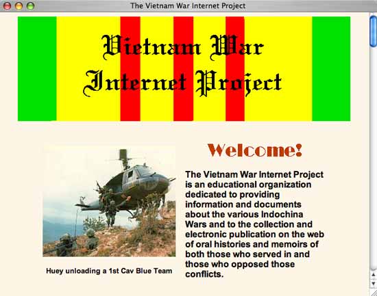
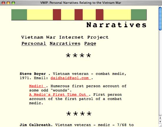
Figure 25: Michael O’Malley’s redesign of this Vietnam history site shows how attention to the major principles of design, such as alignment and repetition, as well as some thought about the site’s theme (why gothic fonts when there are more appropriate ones such as Courier, which suggests typewriting), can transform a haphazard website into a more compelling form.
The application of Williams and Tollett’s four fundamental principles of design will raise a confusing eyesore to a legible, comprehensible, and aesthetically acceptable site. To go further, it is worth spending a little bit of time examining not the conventions of print but the conventions of art. Reacquaint yourself with artists who are masters of some of the formal techniques necessary for a well-designed website. For example, to get a sense of how light and dark elements can be placed on the page and made to contrast with one another and arrange themselves in telling and aesthetically pleasing ways, look at paintings by Joseph Wright of Derby or photographs by Ansel Adams. To see how text can look elegant in columns and rows, spaced properly, and laid out next to images, pick up a book on the Chinese painter and calligrapher Zhao Mengfu or a medieval European book of hours. Such works of art will add other principles—perhaps higher principles—to Williams and Tollett’s fundamentals of alignment, proximity, repetition, and contrast. These include proportion and balance, the advanced use of color and geometry, and the elusive concept known as beauty.
As the saying goes, however, you must first learn to crawl before you can walk, or perhaps run. Good historical web design begins, as Williams and Tollett emphasize, when you place text and any images or multimedia into relationships with each other and the other essential elements of a web page—for example, navigation buttons or a logo—with each element taking its rightful place and garnering the appropriate amount of attention. Alignment, proximity, repetition, and contrast must be used intelligently for visitors to your site to view, read, and understand these elements. We first look at each of the basic features of a web page, and then examine some good examples (and a few less optimal ones) of placing these features together in ways that enable and inspire us to think about and grasp the past (or in the imperfect examples, to obscure it).
9 O’Malley, “Building Effective Course Sites.”
10 Also, see Morris’s typographical and illustrative work for the Kelmscott Press, e.g., the individual head pages for each work in William Shakespeare, The Poems (London: Kelmscott Press, 1893) or the dense artistry found on Morris’s title page for Raoul Lafevre, The Recuyell of the Historyes of Troye (London: Kelmscott Press, 1892); Robert Strassler, ed., The Landmark Thucydides (New York: Free Press, 1996).
11 Edward R. Tufte, The Visual Display of Quantitative Information (Cheshire, Conn.: Graphics Press, 1983); Edward R. Tufte, Envisioning Information (Cheshire, Conn.: Graphics Press, 1990); Edward R. Tufte, Visual Explanations: Images and Quantities, Evidence and Narrative (Cheshire, Conn.: Graphics Press, 1997).
12 Tufte, Visual Display of Quantitative Information, 40, ↪link 4.12.
13 Larry Gales, “Web Page Design Inspired by Edward Tufte,” and “Graphics and Web Design Based on Edward Tufte’s Principles,” Larry Gales, ↪links 4.13a and 4.13b.
14 Jeffrey Zeldman, Designing with Web Standards (Indianapolis, Ind.: New Riders, 2003), 25; “About: Mission,” The Web Standards Project, ↪link 4.14a; Simon Paquet, Marcio Galli, Ian Oeschger, Jim Ley, Daniel Ulrich, and Mike Cowperthwaite, “Using Web Standards in Your Web Pages,” Mozilla, ↪link 4.14b; Apple Developer Connection, “Web Page Development: Best Practices,” Apple, ↪link 4.14c.
15 Robin Williams and John Tollett, The Non-Designers Web Book: An Easy Guide to Creating, Designing, and Posting Your Own Web Site (2nd ed.; Berkeley, Calif.: Peachpit, 2000), Ch. 6.