Designing for the History Web
Text
 ext, the largest part of most historical sites, has to be formatted properly on the web, just as in print. Centuries of experience with books has taught us that we cannot display the written word comfortably in a limitless variety of formats. The way the eye moves across the page mandates that the length of a line of characters be within a certain range—a parameter true for all languages, including those that are written from right to left, such as Arabic, Hebrew, and Urdu, or ideographic languages that are frequently written from the top of the page to the bottom, like Korean, Japanese, and Chinese. Carrying this important print design convention over to the web means that you should restrict a column of text to a width of between 300 and 600 pixels, for a total of between 8 and 16 words per line if you use an average-sized font such as 12 point Times. (On the web the ideographic languages are often written horizontally rather than vertically, so this advice holds true for them as well; if written vertically, keeping the height of a column of characters under 600 pixels helps the viewer with an average computer monitor avoid scrolling to see the bottommost characters.) Obviously, narrower columns look (and read) more like a newspaper, whereas 500 to 600 pixel-wide columns appear more like a book. Regardless of the look you are going for, be sure to maintain white-space (or at least neutral-color) margins on either side of the text. If you plan to have images, illustrations, or charts next to the text, leave at least 10 pixels (and preferably between 30 and 50 pixels) of space between these graphical elements and the block of text.
Robin Walsh’s Journeys in Time: 1809–1822, The Journals of Lachlan & Elizabeth Macquarie shows how historians can design text well on the web. In this case, the text consists of commentaries and historical background by Walsh, as well as featured transcripts from the subjects of the website, two Scots who moved to Australia during a period of great upheaval. Mostly casual journal entries rather than the formal prose found in a book, the text is appropriately set in a relatively slim column 340 pixels wide, nicely aligned vertically with other elements on the page, and with a separation of 40 pixels from the blue left-hand navigation bar. Legacies of the digitization and transcription process (the conversion of the journals from handwriting to machine-readable text), such as strike-throughs and superscript writing, are also handled well.16
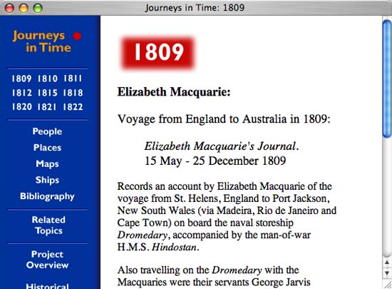
Figure 26: Robin Walsh’s Journeys in Time: 1809-182, the Journals of Lachlan and Elizabeth Macquarie formats its primary source texts extremely well, making them easy to read while retaining as much of the character of the original documents as possible, including super- and subscripted writing.
The font you plan to use depends somewhat on your own taste, but a survey of sites (commercial and noncommercial) that have a lot of text shows a growing agreement that sans-serif fonts (those without little flourishes at the ends of the letters) are more readable than serif fonts online. Years of reading historical texts has predisposed us to the view that sans serif fonts are less serious than serif fonts, but long passages of text do look a little crisper on most screens in sans serif, and moreover they are easier to read at different sizes, particularly the smaller sizes used for notes. Sans-serif fonts found on most computers include Verdana, Arial, and Helvetica; common serif fonts include Times, Times Roman, and Bookman. Try to avoid monospaced fonts like Courier for main blocks of text (though Courier is nice for suggesting typewriting where you seek that effect). While the flexibility of the web permits any font to be of any color, only in rare circumstances should you make your fonts a color other than black (the default color on the web) or near-black, or white or near-white if the background of the text is black or very dark. High contrast is essential for legibility.
But what about the more important question of the text itself, once you have decided on a legible format with the proper specification of column widths, margins, fonts, and hues? Here we diverge from many in the web design community—both commercial and nonprofit designers—as part of our mission as historians. Not surprisingly, the usability school advocates placing only small, quickly scannable passages of text on the web, and far too many web designers have followed this lead. While acknowledging that long-form writing like the journal article can remain intact online, even Patrick Lynch and Sarah Horton, the university-based authors of the Web Style Guide and standard-bearers for academic web design, accept the need for a reduction or “chunking” of most text on the web for ease of use. Lynch and Horton talk about the “disorientation” that occurs when a poor web surfer is forced to read long passages, and they seem resigned to the notion that “most information on the World Wide Web is gathered in short reference documents that are intended to be read nonsequentially.” This acquiescence strikes us as too close to the lowest-common-denominator thinking that historians have always fought against in favor of rich interpretation and the joy of the written word itself. As Jay Leno disparagingly remarked when USA Today began publication, “If you can’t write, list.” Must we condemn the web to a similar future?17
This skepticism toward long-form text on the web may turn out to be transient. More people are reading ever longer passages on a computer screen, and for better or worse that trend will continue because a greater and greater percentage of our lives involves digital media. Monitors have continued to improve, with flat-panel liquid crystal displays now comprising a large share of the market. While these newer technologies still fall short of the exemplary contrast and resolution of print on paper, they are a great improvement and surely the harbinger of even better screens to come. And we concur with Lynch and Horton that users can print out web pages when they want to read a lot of text without the eyestrain associated with screens. Making sure your web pages print easily, or having special pages just for printing, can be a good idea for a historical essay or exhibit site with a lot of text.18
Moreover, we believe in the simple proposition that good writing produces willing readers, regardless of the medium. After all, there are committed readers of websites such as the Chronicle of Higher Education’s Arts & Letters Daily and other sources of relatively highbrow and lengthy texts on the web.19 Unchallenged, the widespread agreement about the chunking of text may produce even less tolerance for long passages on the web as time goes by. Historians must combat this trend aggressively if we are to claim this medium as our own. Instead of cultivating a style that seems suitable to a chronically short attention span, we should rather look for ways to make long passages of text acceptably quick-loading (dividing them if necessary into a sequence of reasonably sized pages, reducing the number and heft of graphics that accompany the text) and readable (by following the formatting rules above in addition to reducing distractions like bands of color and encroaching images). Most of all, we need to give as much attention to our writing on the web as we do to our writing in media that we know will be read, assessed, criticized, and responded to by our peers. Just because the web makes it easy to disseminate the written word doesn’t mean that we should abandon our high standards for prose.
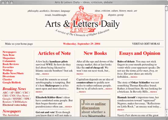
Figure 27: The popularity of the text-heavy Arts & Letters Daily shows that many web surfers have longer attention spans than many web usability and design consultants believe.
16 Macquarie University, Journeys in Time, 1804-1822: The Journals of Lachlan & Elizabeth Macquarie, ↪link 4.16.
17 Patrick Lynch and Sarah Horton, Web Style Guide (2nd ed., New Haven, Conn.: Yale University Press, 2001), 38 and 144–45. This preference for terseness when writing for the web is widespread, including in many academic settings. See, for example, Office of Communications and Marketing, “Writing and Editing for the Web,” Santa Clara University, ↪link 4.17a, and “Writing for the Web: Guidelines for MIT Libraries,” Massachusetts Institute of Technology, ↪link 4.17b. Jakob Nielsen’s mid-1990s web usability studies led to much of this thinking about web prose. See Jakob Nielsen, “How Users Read on the Web,” Alertbox, ↪link 4.17c.
18 To ensure that your pages will print well, use an HTML table of less than 500 pixel width, or CSS layout, to confine the text within an 8½-by-11-inch page (At 72 dpi, an 8½-by-11-inch sheet of paper is 612 pixels wide; you must leave room for margins). We should note, however, that you will have even less control of the look of a print-out than you have over how your website will look on different computers and in different browsers. “Design Tip: Build Print-friendly Pages,” NetMechanic, ↪link 4.18.
19 Chronicle of Higher Education, Arts and Letters Daily, ↪link 4.19.