Designing for the History Web
Putting It All Together
 ypertext, which provides the ability to move in a nonlinear way from one place to another, is a foundational principle of the web, and in such a medium you need to include some basic navigation tools on most, if not all, of the pages on your site. Common to most websites is some way to get back to the home page (for instance, by clicking on the logo for a historical organization or project); links to other main sections of the site, if any; a link to an “about the site” or credits page; and links to pages for any copyright, privacy, usage, or other legal notices (see Chapter 7). For large historical sites or archives, it may also be useful—some would say necessary—to have links to a site map and especially a search page (or simply a search box right on each page).26 Navigation should be an integral part of the design of your site and can help to unify the site’s overall look across a multitude of individual pages.
When all of the pieces—text, images and multimedia (if any), and navigation—come together in a well laid-out and structured historical site, the results can be both visually appealing and informative. The Sport of Life and Death: The Mesoamerican Ballgame, for example, is a well-funded museum site geared mainly toward a K-12 audience that displays many elements of good design, particularly in navigation. In providing a basic history of Mesoamerican culture from 1500 B.C.E. to the encounter with the Spanish, and in allowing schoolchildren (and the young at heart) to show what they’ve learned by putting the appropriate ceremonial garb on the ballgame players and helping them on the field, the site maintains an outstanding graphical consistency. Fonts and the beautiful Mesoamerican icons used for navigation are repeated throughout. Flash graphics and animation are integrated well and supplement the basic navigation for the main sections of the site with helpful, clickable maps and other ways of accessing materials. You could question whether the site’s ubiquitous reliance on Flash and heavy graphics is necessary, especially if you view it over a slow modem. Interactive features would have been difficult to do without Flash, but the site’s creators could have made most of the other parts of the site in plain, faster loading HTML. This is the sort of richly illustrated site that wins web awards (indeed it won the Best Museum Web Site at the Museums and the Web 2002 Conference) because those who hand out such awards always have the latest, fanciest computers and high-speed Internet connections and thus care less about the time it takes to load a web page containing an engaging video clip or interactive map.27
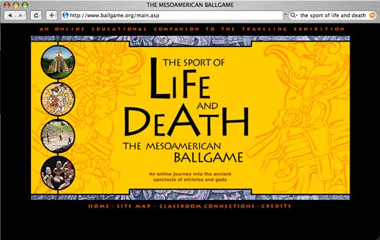
Figure 29: Like many other high-end museum websites, The Sport of Life and Death: The Mesoamerican Ballgame uses images and Flash technology extensively, serving the subject matter well through graphics and interactivity, though making the site less tolerable over a slow modem.
Far less flashy (so to speak) but equally informative, and a good example of an important historical archive made accessible through unobtrusive design, is Gwendolyn Hall’s Afro-Louisiana History and Genealogy, 1718–1820. An attractive grayscale opening page leads to simple, but also attractive (and more colorful), interior pages with information about the collection as well as essential search forms. (The jarring contrast between the home page and the interior pages is somewhat odd, and the designers probably should have chosen one theme or the other.) Throughout, Hall and her team keep things simple, with an emphasis on easily accessing the vast archive of slave records. In particular, the search form uses nicely shaded tables that allow first-time visitors to understand instantly the various fields they can search (such as name, gender, and location), and the search results page is exemplary in its Google-like crisp design. You can scan the results without graphical distractions. All of this would look equally as good on a small or large screen and would function properly on an old computer as well as a brand new one. The explanatory text of the other interior pages is well laid out, though the use of elastic column sizes for text (programmed to fill a certain percentage of the browser window rather a specific number of pixels) means that on a very large screen, some of the text stretches out to less-than-desirable line lengths. For the novice user, Hall could simplify and clarify the Afro-Louisiana History and Genealogy site even further by clarifying the distinctions between the normal search and the “miscellaneous” search, and between the “Introduction” and “About” pages. Combining these elements and using a slightly smaller font, the thick top navigation band could be reduced to a single line, thus freeing up more of the browser window for the site’s important historical content.28
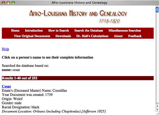
Figure 30: The spare, nicely laid out search results pages of Gwendolyn Hall’s Afro-Louisiana History and Genealogy, 1718-1820 provide a clear window into its extensive archive of primary sources.
Rice University’s Galileo Project, an engaging topical site on the Renaissance thinker and scientist, has a consistent and attractive light blue and gray design theme throughout, from the home page through the most interior pages. This theme, however, works better for the similarly hued images than the text, which most visitors to the site will regard as more important. Take the first page of Galileo’s biography, for instance. The serif typeface is blue with the underlined links in gray, both of which are difficult to read against the white background. Worse, the text is right justified to cozy up with the image of the Leaning Tower of Pisa, yet readers of English are used to text that is justified to the left margin and thus would find this page’s legibility less than ideal. The creators of the site have constructed the more text-heavy pages, such as the biography of Pope Urban VIII, better, using a left-justified, 403-pixel-wide column that marshals the words into a book-like, readable format. Unfortunately, even here, the text remains blue and gray, poor choices for a historical website consisting predominantly of text.29
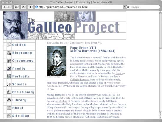
Figure 31: This page from Rice University’s Galileo Project highlights the effectiveness of principles such as alignment and repetition. Unfortunately, some other pages on the site have poor contrast and hard-to-read right-jusified text.
26 Jakob Nielsen, “Search: Visible and Simple,” Alertbox, ↪link 4.26a; Michael Bernard, “Developing Schemas for the Location of Common Web Objects,” Usability News, 3.1 (2001), ↪link 4.26b.
27 Mint Museum, The Mesoamerican Ballgame, ↪link 4.27a; Archives & Museum Informatics, “Best Museum Web Site,” Museums and the Web 2002: The Best of the Web, ↪link 4.27b.
28 Gwendolyn Midlo Hall, Afro-Louisiana History and Genealogy 1719–1820, ↪link 4.28.
29 Albert Van Helden and Elizabeth Burr, The Galileo Project, ↪link 4.29a; “Galileo’s Early Life,” ↪link 4.29b; “Pope Urban VIII,” ↪link 4.29c.