Designing for the History Web
Images, Color, and Multimedia
 dward Tufte’s conclusions about the often superfluous or distracting role of graphical elements in print media represent an equally good admonishment to historians who find themselves attracted by the ease with which one can place images and other nontext features on a web page. Indeed, the mere availability of color and the possibility of using an unlimited number of images (or even video and audio) on a site present welcome opportunities for scholars who have had to content themselves with producing black-and-white books with at most a small number of gray-scale photographs or graphics. A publisher’s concession of a handful of additional images, or a segment of a book with color reproductions, has been known to cause much rejoicing among historians who have signed a book contract. The fact that you can add as many full-color graphics as you would like and even change the color of the “paper” a web page is “written” on is enticing.
Although historians do not need to stoically ignore the magical temptation of color and graphics, they would be wise to remember what happened to the sailors who became entranced by the goddess Circe. No one wants a porcine website replete with ugly images and garish hues. Lynch and Horton make some sensible recommendations about the use of color that can help historians avoid this predicament. If you decide to use large areas of color on your website, either to differentiate sections of a page or as a background, choose an unobtrusive color such as beige, grey, or one of the pastels, or at the very least choose a color your text will read well against.20 With a restrained baseline color, images and text will stand out, and the viewer’s eyes will be attracted to what’s important rather than the background or page margins. Although HTML makes it possible to have an image as a background (either singly, taking up the whole page, or “tiled,” where it repeats across the page), avoid doing so. Background images distract readers and make any overlaid text less legible.
Follow the same principles of color that have proven successful in print. In Envisioning Information, Edward Tufte notes that color is the principal way the mind separates elements in space and chooses something to focus on. Thus you should use rich or bright colors like red and yellow sparingly, and generally only for items you really wish to emphasize. Use different colors rather than different shapes to distinguish features on a page. Beware of the negative effects of certain highly contrasting colors placed next to each other (such as green and red), as well as the off-putting optical illusions created, for instance, by a series of parallel lines. If navigational elements have color at all, make sure their hues don’t distractviewers from focusing on the main content of the page.21
Web design publications often talk about using only “web-safe” or “browser-safe” colors, meaning a limited palette that will show up roughly the same in all browsers and operating systems. But, as the web designer Lynda Weinman has noted, very few computers still display only 256 colors, their capability when the web was young. Indeed, most people view the web in millions of colors now, and so historians just starting on the web may ignore the browser-safe palette and its often garish, overly bright colors chosen for their mathematical simplicity rather than aesthetic value. Those experienced with this palette can continue to use it with no harm, but others shouldn’t bother. The possible exception to this rule is if many of your anticipated users will be using very old computers, in which case you should choose something from the web-safe palette for any major swath of color on your page, as well as any colored fonts.22
In Chapter 3 we discussed the differences among various digital image formats. Now is the time that you can show what you have learned by making sure that you predominantly use one of the slimmer formats, JPEG or GIF. You do not have to banish those larger TIFFs, however. If your site needs detailed images to illustrate historical points or if it is an archive that values the extra information only a “heavy,” high-resolution format can provide, link to the larger image from a thumbnail version (a small version of the original) that is in JPEG or GIF format (and warn your visitors about a possible delay in downloading the bigger file). Fred Lifton, Michael Hanrahan, and Reed College’s Faculty Multimedia Lab’s website on nineteenth-century Formosa reflects a good understanding of the technical aspects of image reproduction on the web—at least beyond its large-graphic home page, which takes too long to load over a dial-up modem. Starting with small thumbnails on introductory pages, they then provide internal pages that have not one but three higher resolution formats. You can easily find what you are looking for, and then zoom in to the level of detail you desire.23
Thumbnail images also present an excellent opportunity to use a fundamental design principle Tufte calls “small multiples.” Small multiples empower the strong human ability to compare and contrast—an important element in historical reasoning and argument. On the web, placing a series of thumbnail images of between 75 x 75 and 300 x 300 pixel size close to each other creates the effect. Although they are a bit too small in our opinion, the dozens of black-and-white images of the Amiens Cathedral Project at Columbia University show the power of small multiples. Redone in a slightly larger size and released from their slender right-hand frame, these images could provide in a single glance an overview of the cathedral and smart navigation for the site. Harappa: The Indus Valley and the Raj in India and Pakistan also uses small multiples to display and annotate finds from archaeological digs. The thumbnails are again slightly too small but they are clear enough to give the novice viewer of this art history a fascinating overview of the field. Dana Leibsohn and Barbara Mundy’s Vistas: Visual Culture in Spanish America, 1520–1820 gets almost everything right in their gallery of images. The multiple images are sized well and contrast nicely with the black background. No unnecessary borders or fake frames crowd the images. You feel as though you are in a museum, and yet the web experience means that you can zoom in on any of the thumbnails to examine them more closely. As Vistas shows, besides providing information in a potent and compact format while providing links to other pages and sections of a website, small multiples also tend to look good in a purely artistic way.24
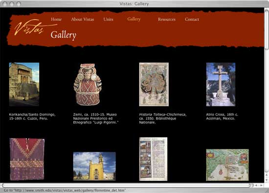
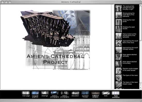
Figure 28: Vistas: Visual Culture in Spanish America, 1520-1820 and The Amiens Cathedral Project use small versions, or thumbnails, of their images to provide a helpful overview of what’s inside.
The same principles hold true for multimedia: if you have many video, Flash, or animation files, you should try to use thumbnail stills from them as launch points. For audio, brief text excerpts transcribed from the best part of the recording or a short summary provide acceptable substitutes. Historical Voices’s website Remembering the Flint Sit-Down Strike, 1936–1937, uses several methods to provide entrée into their recordings: in some cases they matched archival photographs with the audio segments, and in other cases they composed brief descriptions. For both audio and video, you should add a time stamp showing how long a segment is (in minutes and seconds) and the total size of the multimedia file in megabytes (if you are not using streaming software). The Flint website does not do this, and thus visitors are left to wonder how long the audio will last.25
20 Lynch and Horton, Web Style Guide, 183–84.
21 Tufte, Envisioning Information, 90ff.; Larry Gales, “Graphics and Web Design Based on Edward Tufte’s Principles—Color,” Larry Gales, ↪link 4.21.
22 This was due to the 8-bit video cards installed on most computers, PCs as well as Macs. See Lynda Weinman, “Non-Dithering Colors in Browsers,” lynda.com, ↪link 4.22a. Weinman provides a good palette, organized by hue rather than hexadecimal code, for choosing web-safe colors. See ↪link 4.22b.
23 There are two ways of doing thumbnails. The first, and simplest, is to simply shrink the entire image (using graphics software like Photoshop Elements) to a smaller, more manageable size. The second, more time-intensive, manner is to choose a representative portion of the image and crop and zoom into that area of the original. Some web designers advocate using this second method exclusively. However, it is in part a matter of taste and a function of what you are thumbnailing. It is true that small images of maps, for instance, can be almost indecipherable, but other images shrink remarkably well. Try both methods to see which one works best for your project. For the Formosa site, see the Reed Institute, Formosa: Nineteenth Century Images, ↪link 4.23.
24 Media Center for Art History, Amiens Cathedral Project, ↪link 4.24a; Harappa: The Indus Valley and the Raj in India and Pakistan, ↪link 4.24b; Dana Leibsohn and Barbara Mundy, “Vistas Main Gallery,” Vistas: Spanish American Visual Culture, 1520–1820, ↪link 4.24c.
25 The Flint Sit-Down Strike Audio Gallery, Historicalvoices.org, ↪link 4.25.